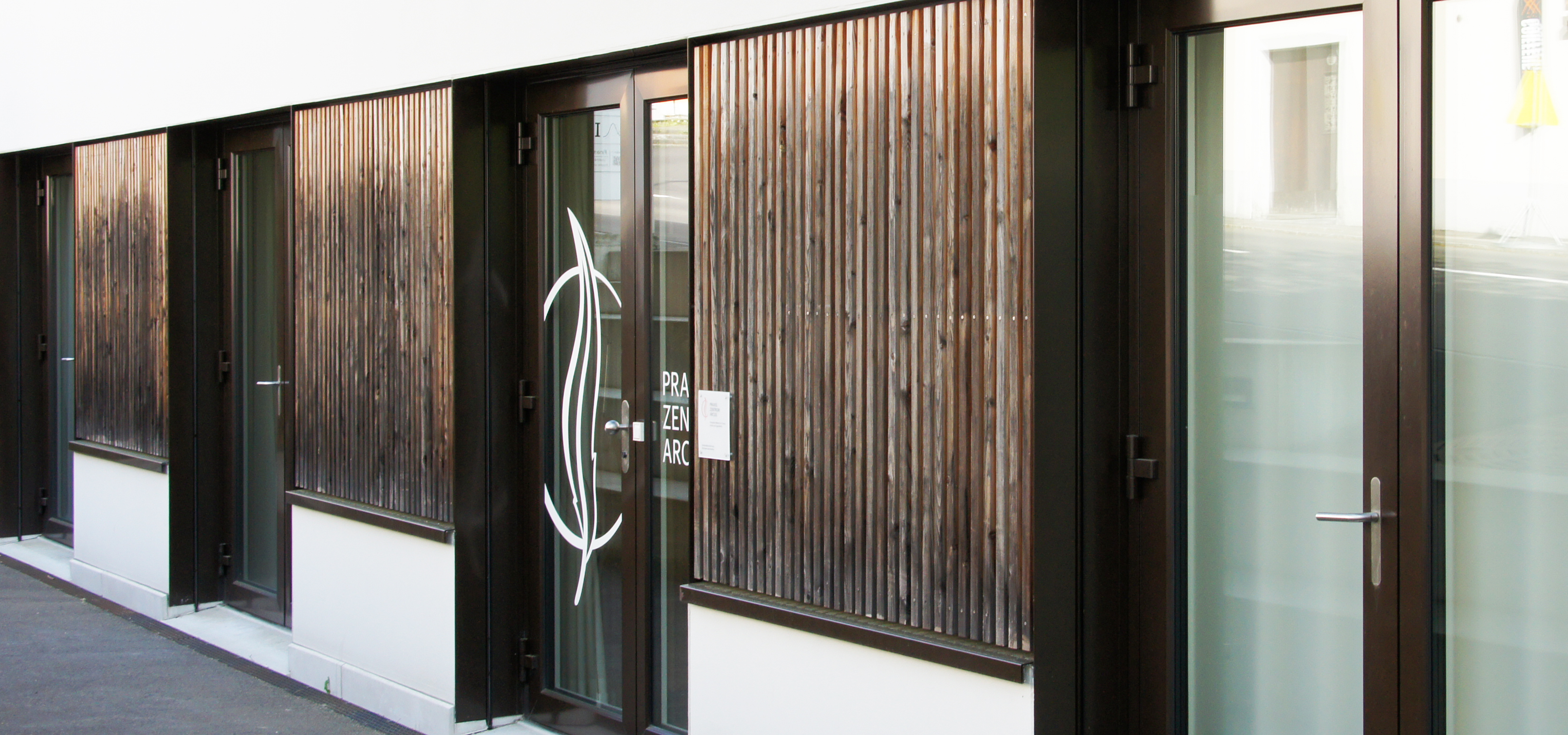
Arcus
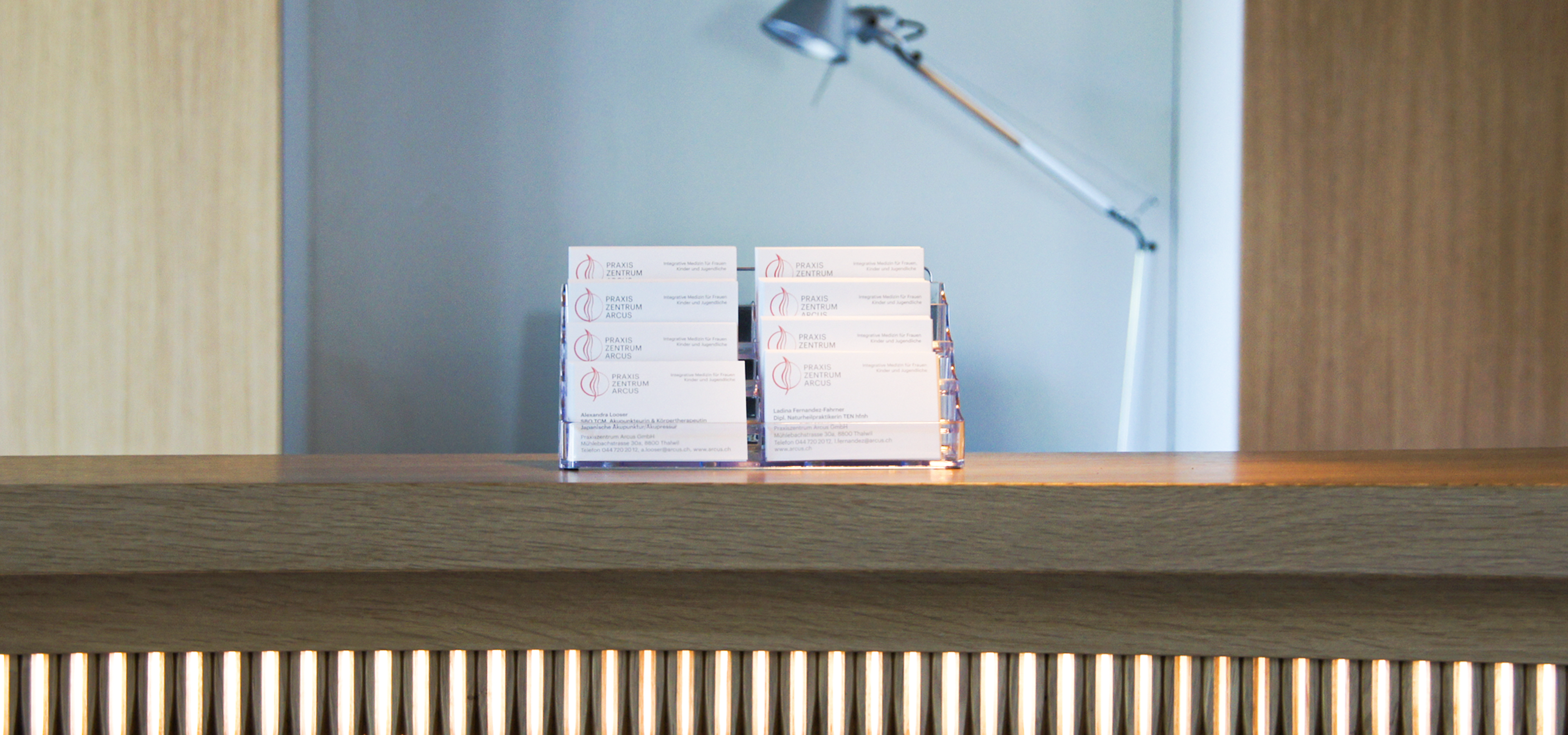
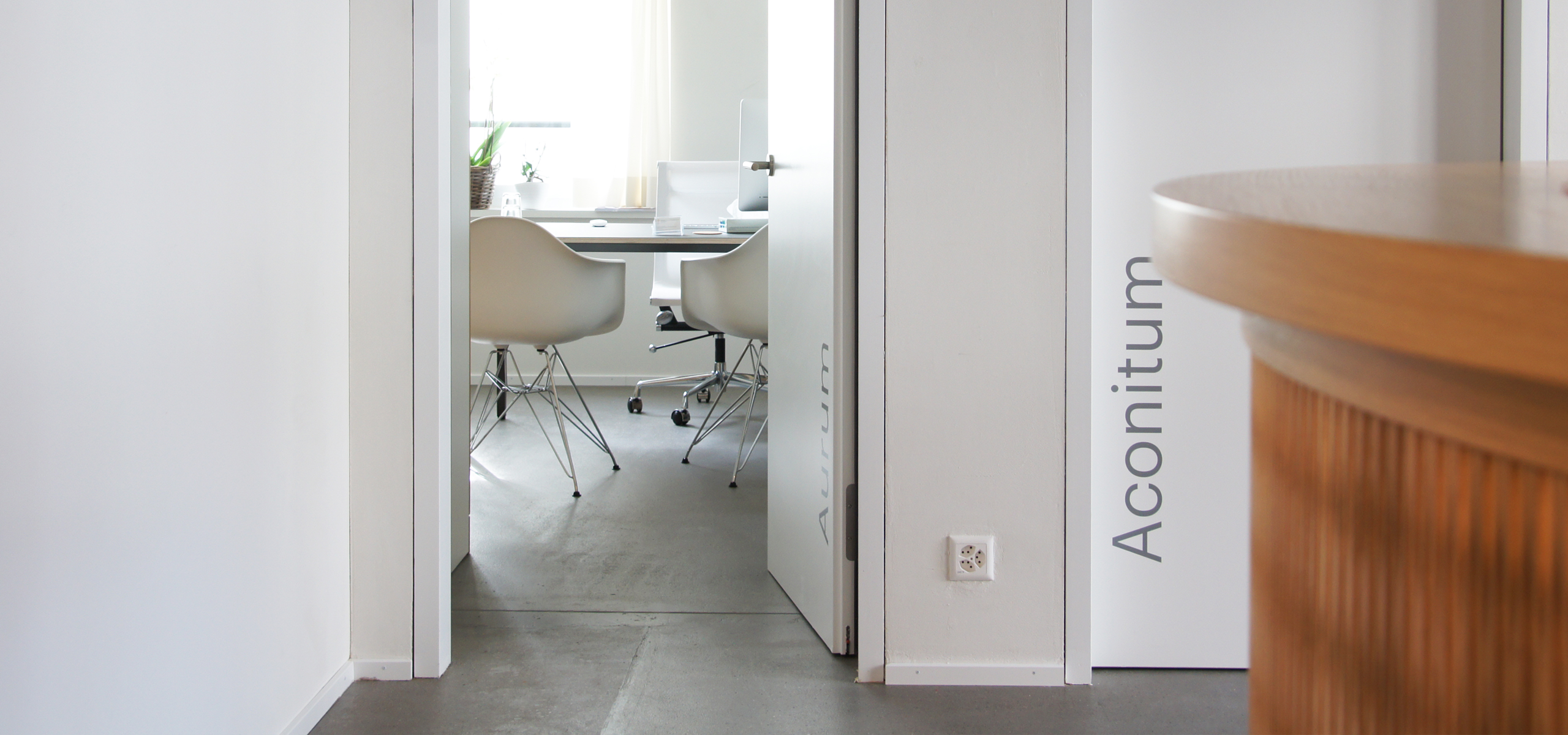
I was asked to create the entire corporate design from A to Z for the newly medical centre Arcus. Initially, it was a holistic medical centre for women. With this in mind, I designed the logo and the visual identity. It should appear soft and yet with clear lines and elements. The circle symbolises the holistic offer, which combines both complementary medicine and conventional medicine. Gradually, the range of services expanded and new areas were added, for which I designed circular elements based on the circle in the logo.


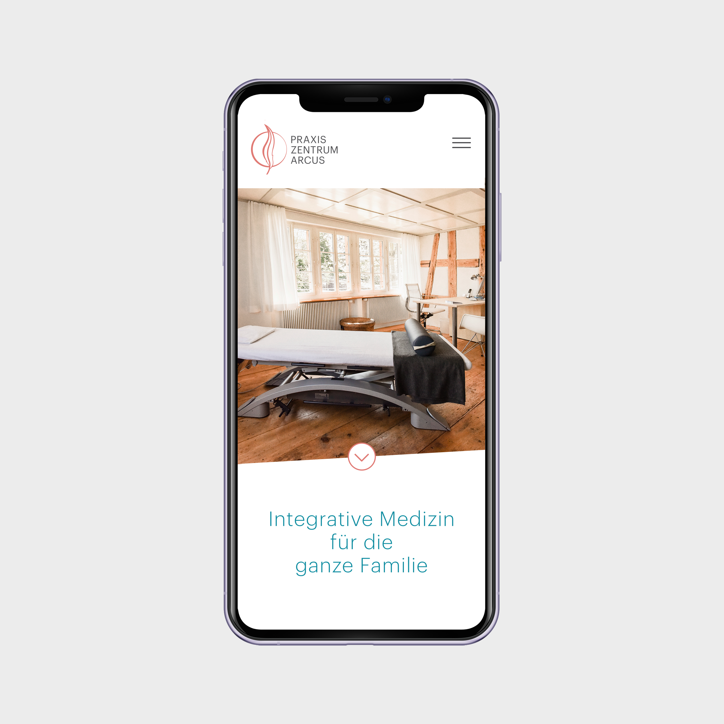

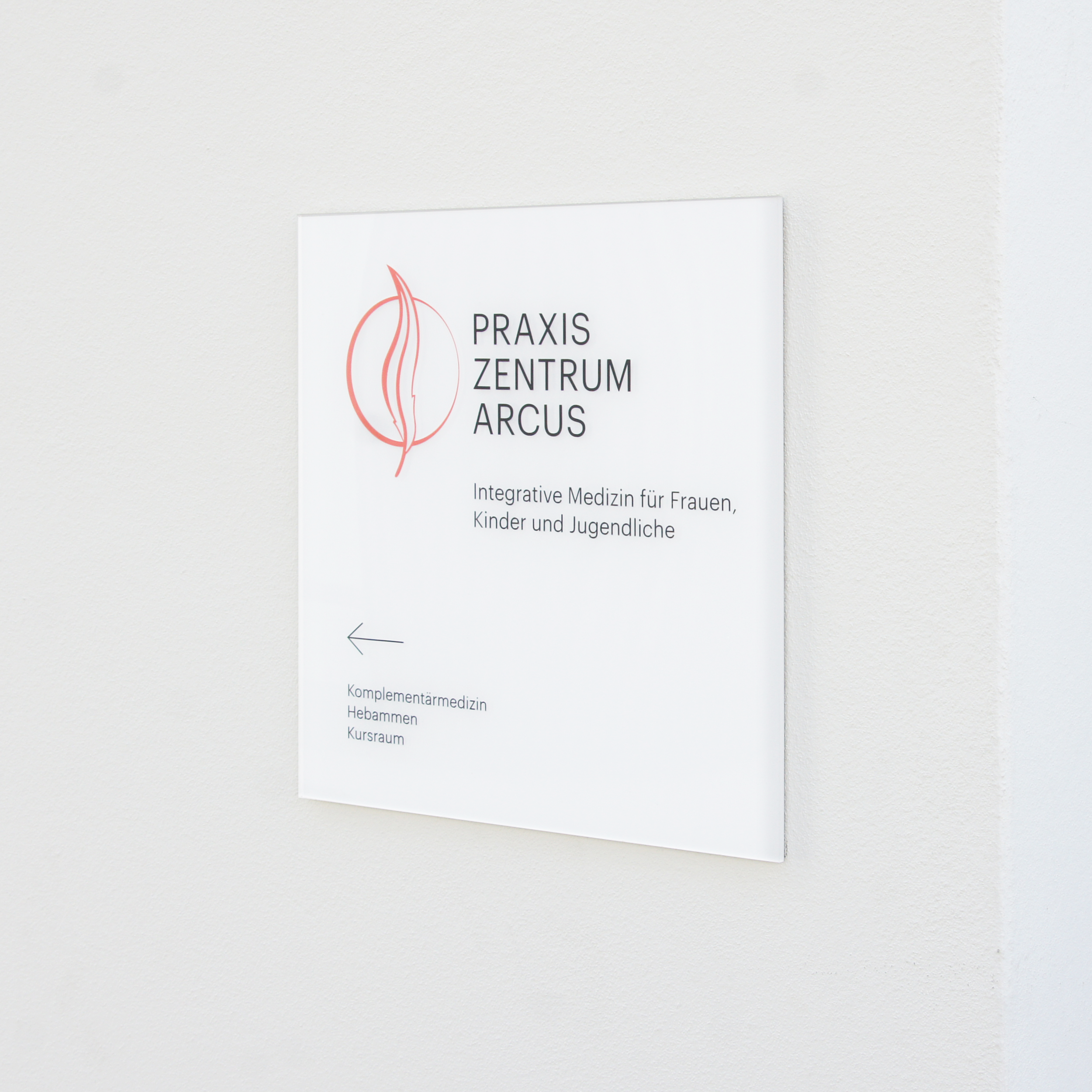
The rooster is the name of the practice's listed building and is therefore part of the core of the Arcus practice centre. The feather in the logo also represents the connection to the practice building, as well as femininity, pregnancy and osteopathy.
